Is anyone out there still performing bulk RNA-Seq? I am sure that it is far from dying out but judging by what scientists talk about and report on, single cell RNA sequencing (scRNA-Seq) has become the new norm.
Although, when you think about it, it can hardly be called a novel approach. The first manuscript on scRNA-Seq was published in 2009 (Tang F, et al. 2009), but you may be surprised to hear that the basic principles were described in the 1990s (seminal works by Paul Coleman and Norman Iscove). That decade (or three) is quite negligible for a geologist, but in terms of molecular biology, scRNA-Seq is getting gray hair. In comparison, bioinformatics analysis of scRNA-Seq data has yet to mature and there is no consensus in the community.
Single Cell analysis is a larger topic than what is possible in a single blog post. To break it down into bite-size reading, we’ll talk about each step in a separate blog post.
Step One: Clear the Path for Clean Single Cell Analysis
Like with any other analysis, the golden rule of garbage in, garbage out still applies, so once you have the quantified matrix, you should do some exploratory analysis, on both the cell and gene levels.
Cell-Level Exploratory Analysis
Let’s start with cells. You may want to look at the fraction of mitochondrial counts per cell (i.e., the ratio of reads mapping to mitochondrial genes the total number of reads; Figure 1). Cells with an increase in the proportion of mitochondrial genes may be apoptotic and, hence, should be excluded from the analysis. The decision on the cut-off should be made considering the experiment and the samples, but values of 5% or 10% are quite common for single cell analysis studies.
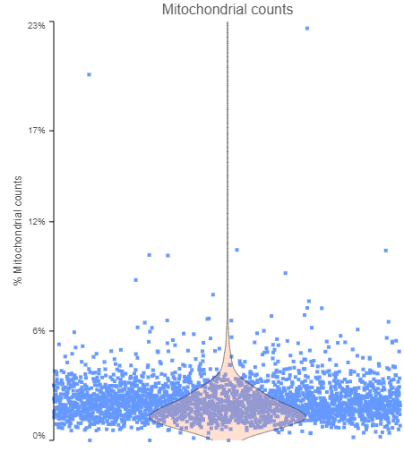 Figure 1. The fraction of mitochondrial counts per cell. Each data point is a single cell, while the pink violin summarizes the data distribution. The plot is based on a publicly available data set, provided by 10x Genomics.
Next, some cells may show unusually high count numbers. As an example, I plotted the results of a Drop-Seq experiment (Figure 2). The cell in the top right corner has ~1.3 million reads, which is some 1000⨉ more than most of the cells. That event is most likely not a single cell, but a doublet (or a triplet) and, again, should be excluded from any downstream steps.
Tip! Use a violin plot to show the data distribution of your single cell analysis experiment. It makes it easier to set the cutoff.
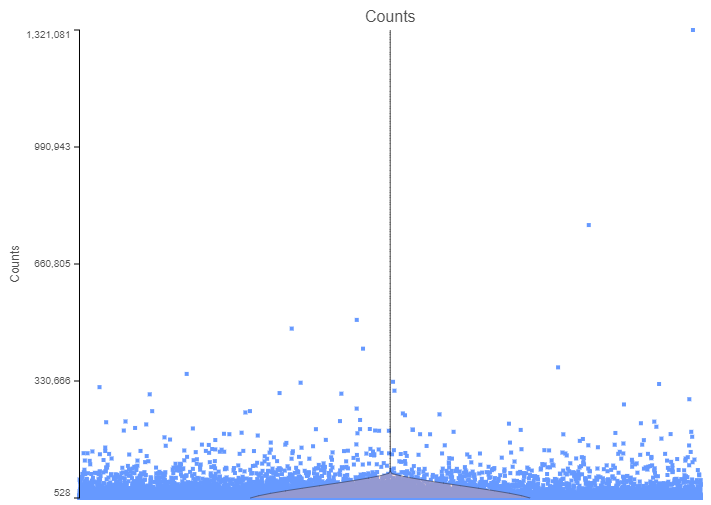 Figure 2. The number of counts per cell. Each data point is a single cell, while the pink violin summarizes the data distribution. The plot is based on a Drop-Seq data set.
Gene Level Exploratory Analysis
There are also several gene-level matrices that you should take into consideration. Going over a distribution plot like the one in Figure 3, based on a 10x Genomics data set, will reveal the genes with the highest number of reads.
Filtering the Genes
One way to interpret a distribution plot is to see where you are investing your reads. For example, out of the ten top genes in Figure 3, six are ribosomal genes. Unless you are specifically interested in ribosomal biology or translation machinery, you may want to remove them from the downstream steps, since their presence only introduces noise in the single cell analysis.
Tip! A list of ribosomal genes can be downloaded from genenames.org.
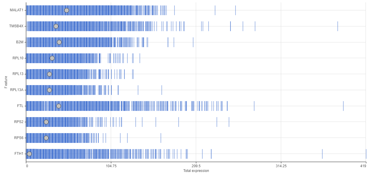 Figure 3. Feature distribution plot. The horizontal axis shows the number of reads per gene, while the genes are listed on the vertical axis. Each data point (blue bar) is a single cell. The grey dots indicate the median.
There is an additional filter strategy to consider: what genes to focus on? One approach is to prune the genes that are not detected (for example, have 0 counts across the cells) or that are detected in a few cells only (“background”; for example, have 0 counts in at least 99% of the cells).
We advise you to carefully interpret the non-detectable genes: are those genes not expressed in your cells (=biology) or are you not picking them up due to the experimental setup, e.g., insufficient sequencing depth (=technology)?
Another approach is to filter only the most variable genes, with the rationale that those genes are also the most informative ones. This is quite appealing and can help to identify the main cell groups. On the flip side, key biological information may be lost.
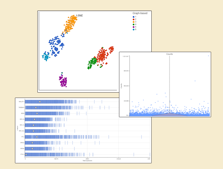
Irrespective of your decision, filter strategy needs to be considered when interpreting the results. To illustrate the impact of filtering, let us compare two t-SNE charts, based on the same 10x Genomics data (Figure 4): all the detected genes were used for the t-SNE on the left (in this case: 6,178), while only the 100 most variable genes were used for the one on the right. As shown by overlaying the output of graph-based clustering, the cells in the left panel form five, while the cells in the right panel form six clusters.
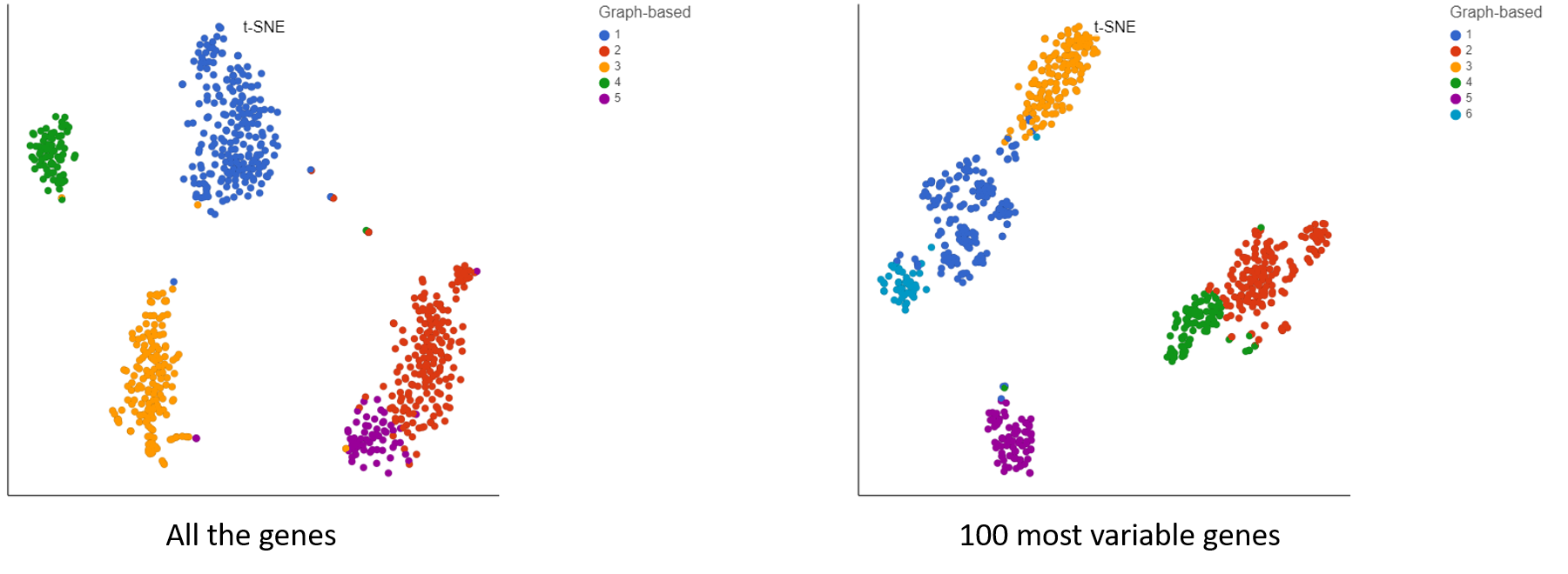 Figure 4. Impact of gene filtering on cell clustering. Each dot is a single cell (713 in total; public data set by 10x Genomics). t-SNE is based on either all the detected genes (left) or the top 100 genes by variance (right). Graph-based clustering output is indicated by color.
Having performed cell-based and gene-based filtering you are one (big) step closer to the analytical data set, but there is still work to be done. For example, you may want to eliminate technical nuisance factors by using batch removal or scaling. These procedures will be addressed in our next blog post. Sign up for blog post email notifications in the form on the right. In the meantime, if you have questions about this blog or there is a topic you would like us to focus on, please let us know. We would love to hear from you!