Just like people, cells are sometimes mysterious and do not readily reveal their true identity. If you want an example, just think of metastatic cancer cells, which sometimes lose all the hallmark features of their mother tissue, making detection of the primary tumor site difficult. Or another example, single cell RNA-Seq. Getting a nice t-distributed stochastic neighbor embedding (t-SNE) chart based on sequencing data is pretty much straightforward but figuring out their biological nature can be quite challenging.
One approach to classifying the cells into groups is to use marker genes (for more, see the Partek webinar recording on identifying cell populations). An extension of that concept is to use gene groups, such as pathways (as detailed in our webinar on visualizing pathways). Although these strategies are very useful, they are not applicable to every research situation. For instance, you may want to come up with a completely new set of marker genes, or you may want to work hypothesis-free.
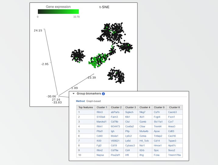
To handle those situations, Partek® Flow® combines clustering results with t-SNE visualization. If you perform clustering and then invoke the t-SNE chart on the result, Partek Flow will generate a Gene biomarkers table, with genes specific for every cluster (Figure 1). Moreover, a clustering algorithm does not have to be involved, you can simply classify cells into groups by selecting them directly on the chart and Partek Flow will produce biomarkers of your custom groups. The biomarkers table is based on a comparison of one cluster at a time versus all the other clusters combined. The gene list is then filtered by using p-value (0.05) and fold-change criteria (|1.5|), ranked by the p-value, and the top 10 genes are then listed in the table. The gene symbols in the table are linked to the t-SNE chart. By selecting a gene, the chart will be colored by the expression levels of that gene. What if you do not want to compare a particular cluster with all the remaining cells, but would rather pick two clusters and contrast them directly? That is also easily performed in Partek Flow and for how-to instructions; we invite you to look at our webinar on identifying group biomarkers.
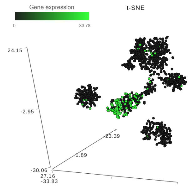
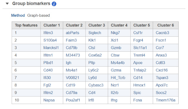
FIGURE 1 Detecting biomarkers using single cell toolkit of Partek® Flow®. When a t-SNE (t-distributed stochastic neighbor embedding) chart is invoked on a result of K-means clustering or graph-based clustering, the plot is supplemented by a Group biomarkers table (left panel) listing the top 10 genes which are differentially expressed between each cluster and the rest of the data. Selecting a gene in the Group biomarkers table colors the cells on the t-SNE chart by the expression level of the selected gene (black: low, green: high). The right panel shows expression levels of the gene Cd79b in mouse splenocytes (dots). Data from the study “Massively Parallel Single-Cell RNA-Seq for Marker-Free Decomposition of Tissues into Cell Types”, downloaded from the Gene Expression Omnibus